TrusTrace Brand Book
Welcome to the TrusTrace brand book – your go-to guide for everything about our brand including visual and voice guidelines, and links to download media assets. Follow these guidelines and inspiration to help bring the TrusTrace identity to life.
Logo Use
Logo Clear Space
Minimum Logo Size
Logo Do's and Don'ts
Do:
- Use the TrusTrace logo in its original form for consistency and clarity
Don’t:
- Alter the colors of the logo
- Modify the symbol placement
- Use the logotype without the symbol
- Stretch or squeeze the logo
Adhering to these guidelines ensures a consistent and professional brand presence.
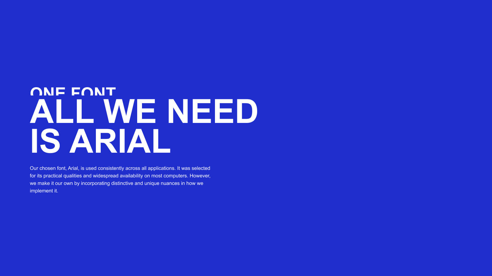
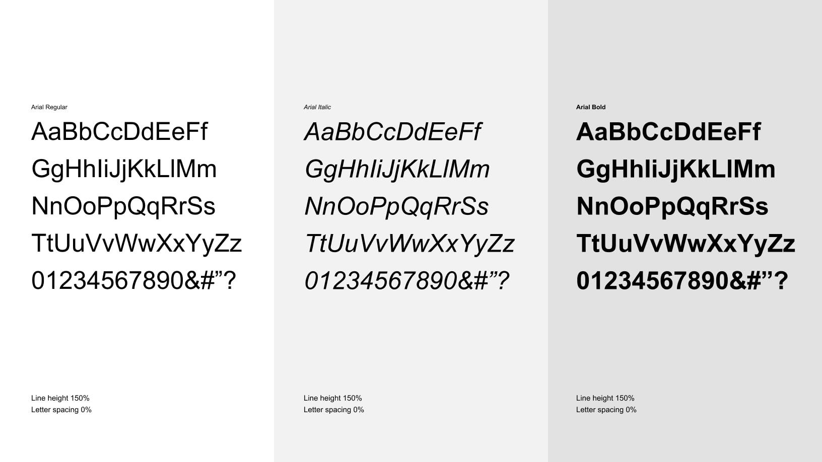
Font Use
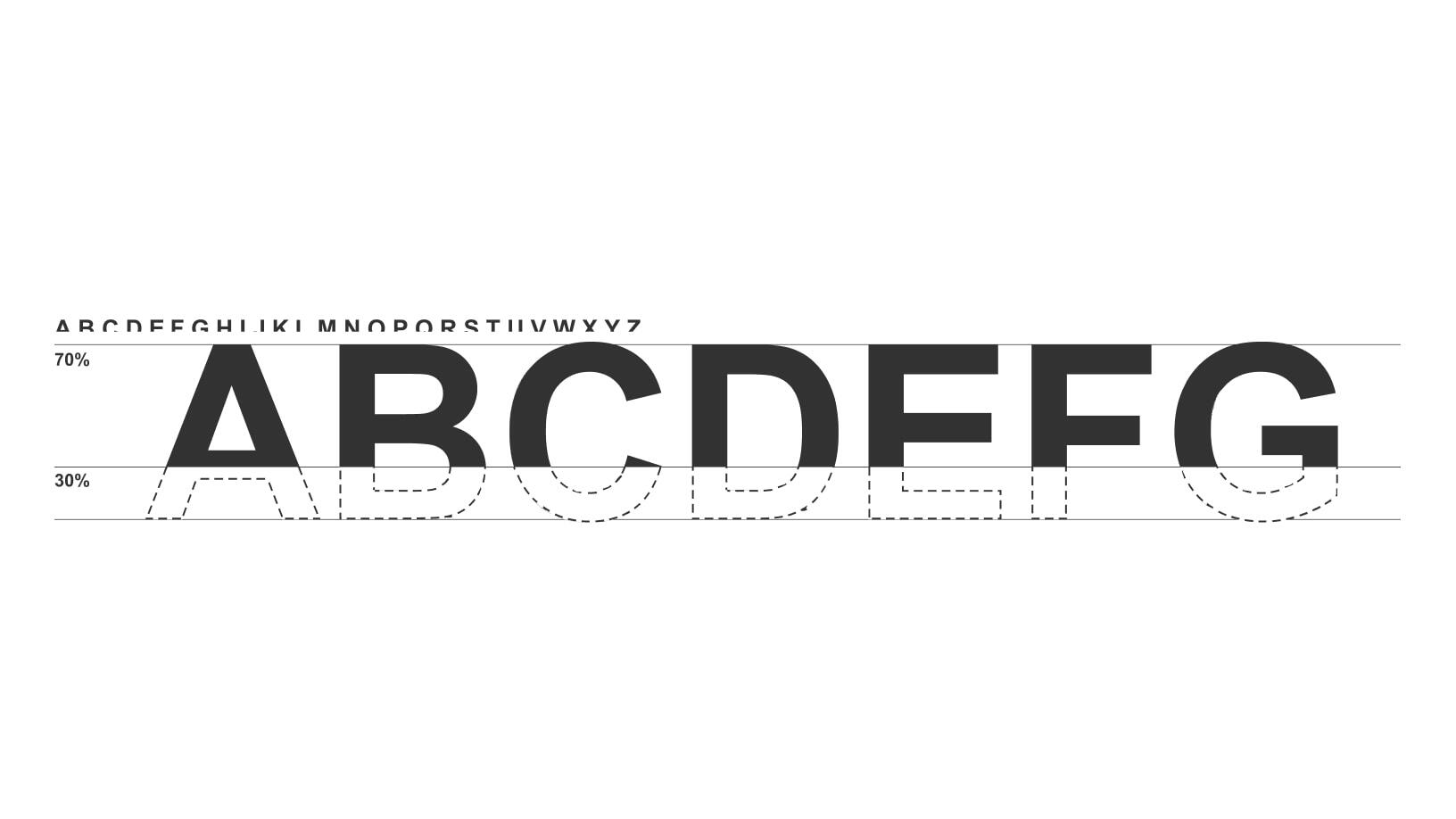
Layered Headline
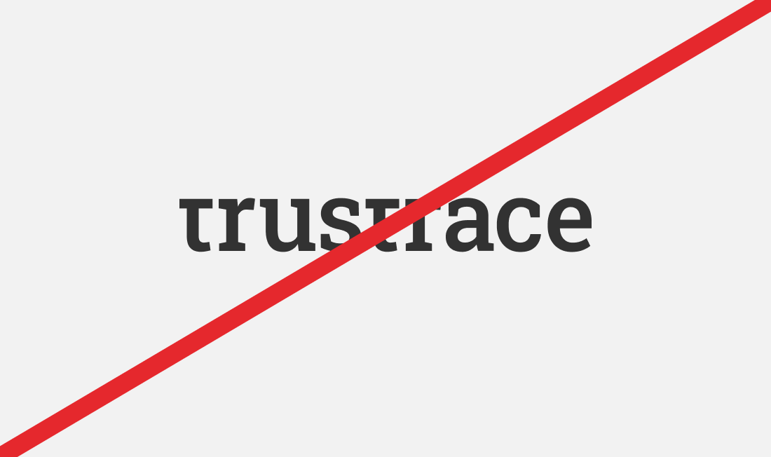
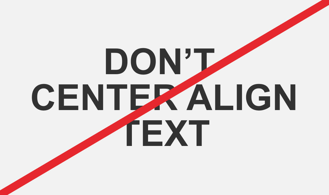
Typesetting Do's and Don'ts
Do:
- Use Arial Bold in ALL CAPS for headlines with a line height of 100%.
- Set body text in Arial Regular with a line height of 150% for readability and balance.
Don’t:
- Use sentence case or mixed case for headlines.
- Apply incorrect line-height, disrupting clarity and consistency.
Proper typesetting ensures a clean, professional, and accessible design.

Colors
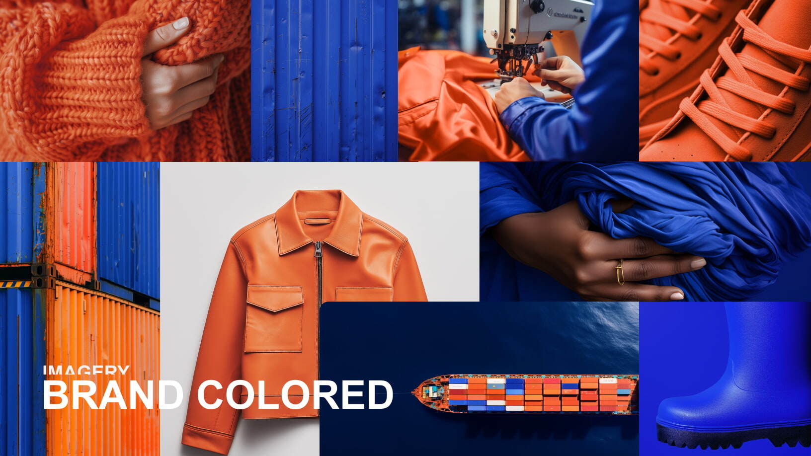
Our primary colors, Swedish Blue and Indian Orange, represent the foundation of TrusTrace. Swedish Blue reflects our Scandinavian headquarters in Sweden, while Indian Orange honors our origins in India, where TrusTrace was founded to tackle the environmental impact of textile production. Together, they signify our vision of a future where all value chains are traceable, circular and fair.
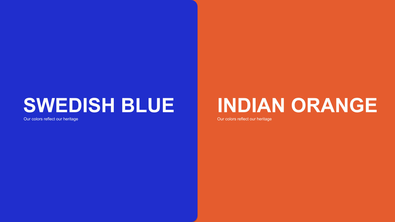
Primary Palette
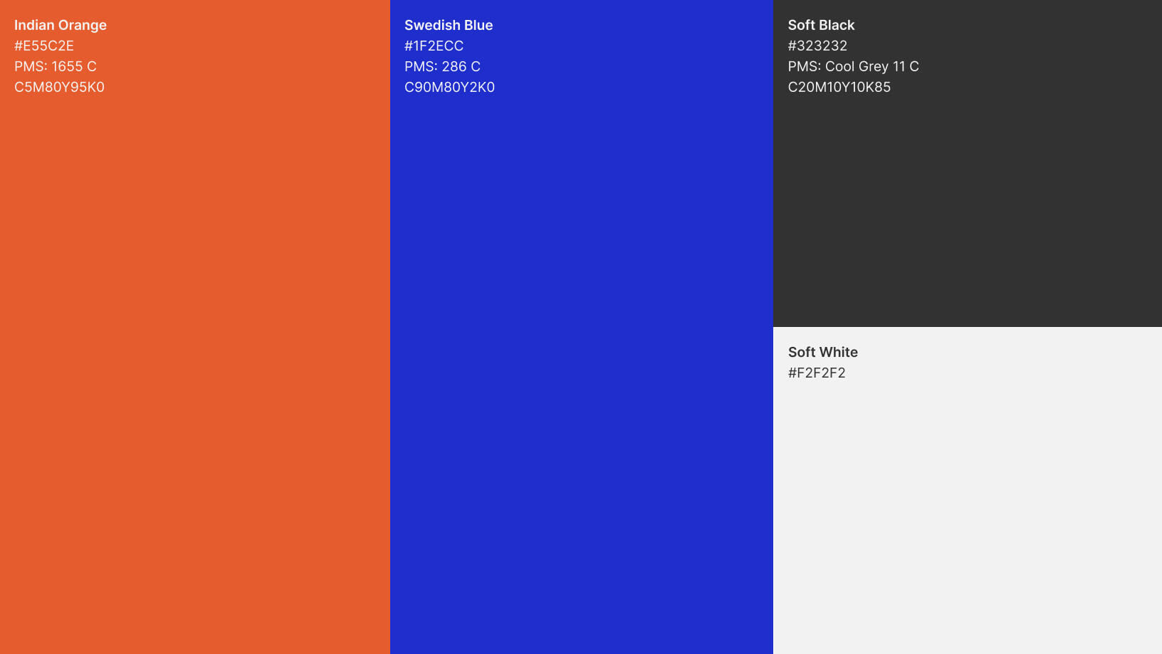
Color Codes
- Swedish Blue: #1F2ECC
- Indian Orange: #E55C2E
- Soft Black: #323232
- Soft White: #F2F2F2
Using Our Colors
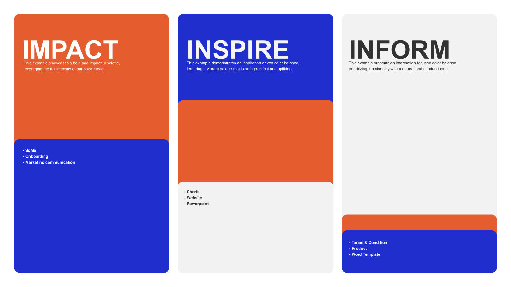
Our colors adapt to the content's purpose:
- Impact: Bold use of colors for social media, campaigns and marketing communication.
- Inspire: A vibrant, balanced palette for charts, websites, and presentations.
- Inform: Neutral tones for functional materials like terms, product info, and text-dense documents.
This approach ensures clarity and alignment with TrusTrace’s identity.
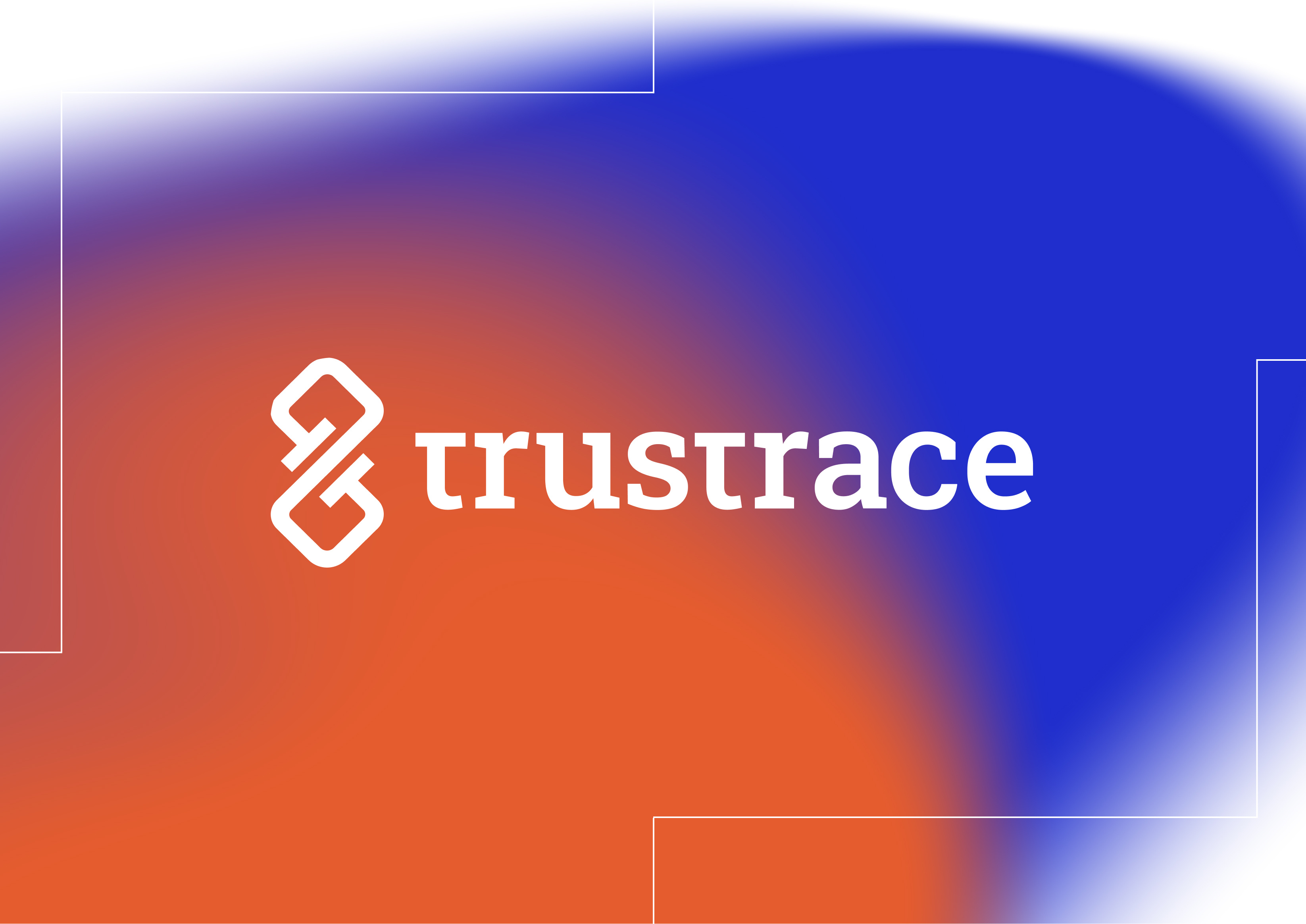
Gradients
To create a softer visual impact, Indian Orange and Swedish Blue can be blended into a radial gradient, showcasing 100% of both base colors. This approach adds depth while maintaining our brand identity.

Color Usage: Do's and Don'ts
Do:
- Use approved color combinations from the TrusTrace palette.
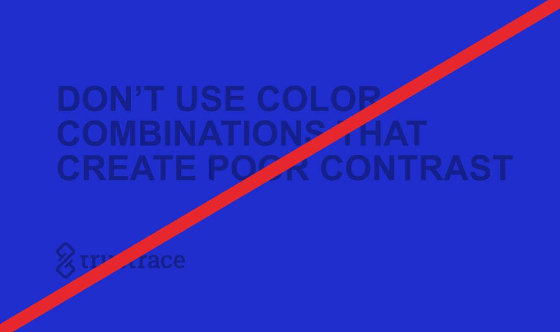
- Ensure sufficient contrast between text and background for readability.
Don’t:
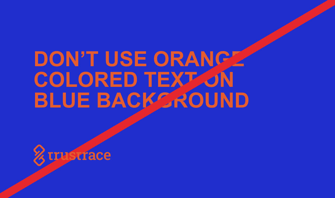
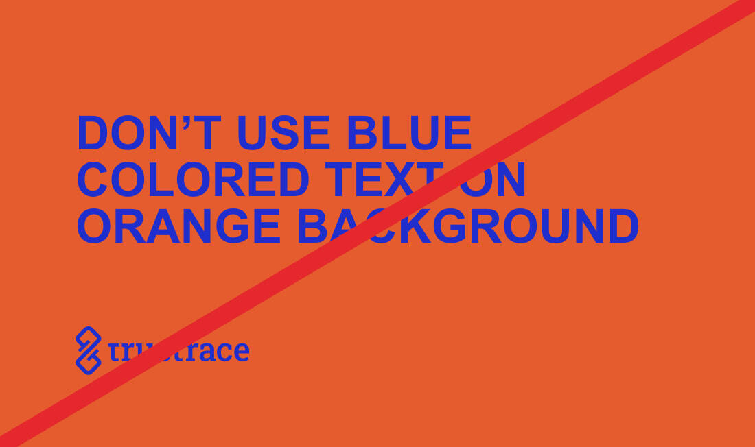
- Unapproved color combinations.
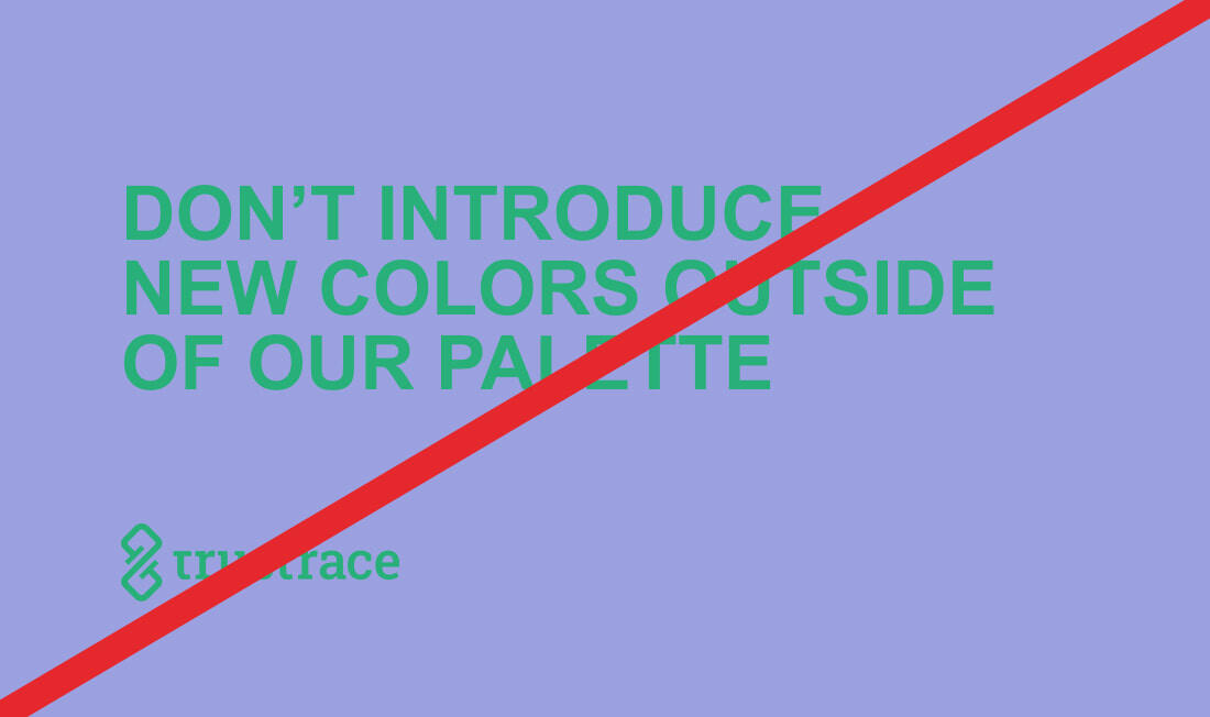
- Introduce new colors outside the brand palette.
- Designs with poor color contrast.
Following these guidelines ensures consistency and accessibility in all TrusTrace visuals.
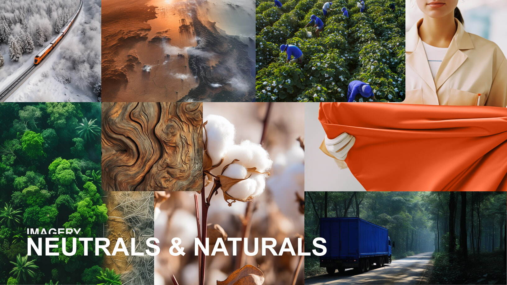
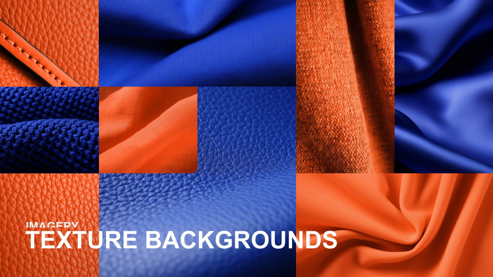
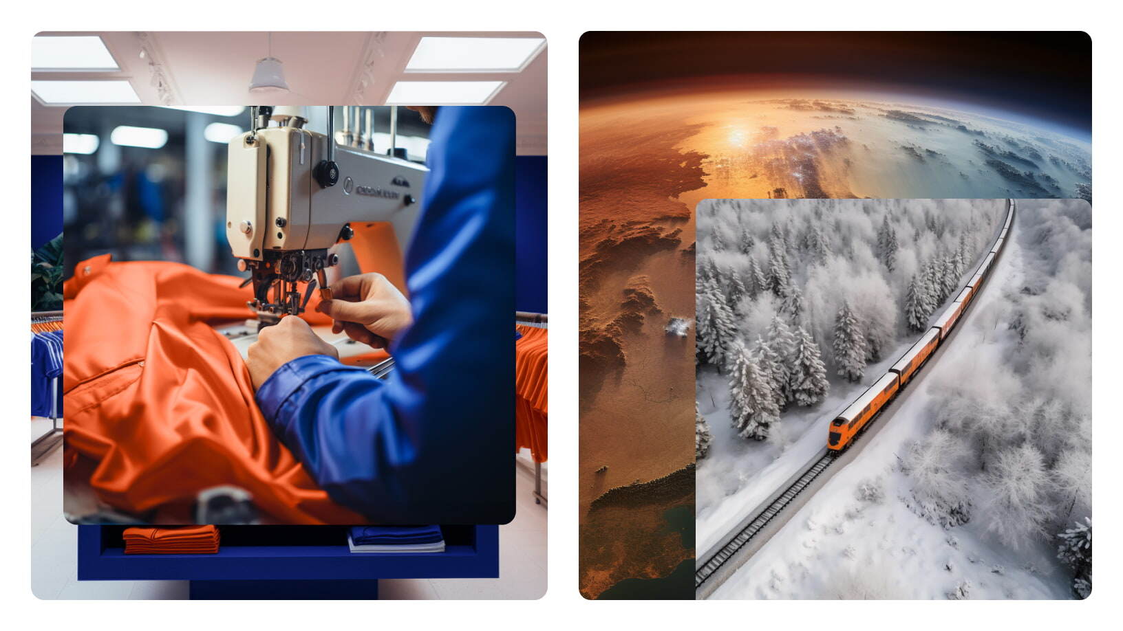
Imagery
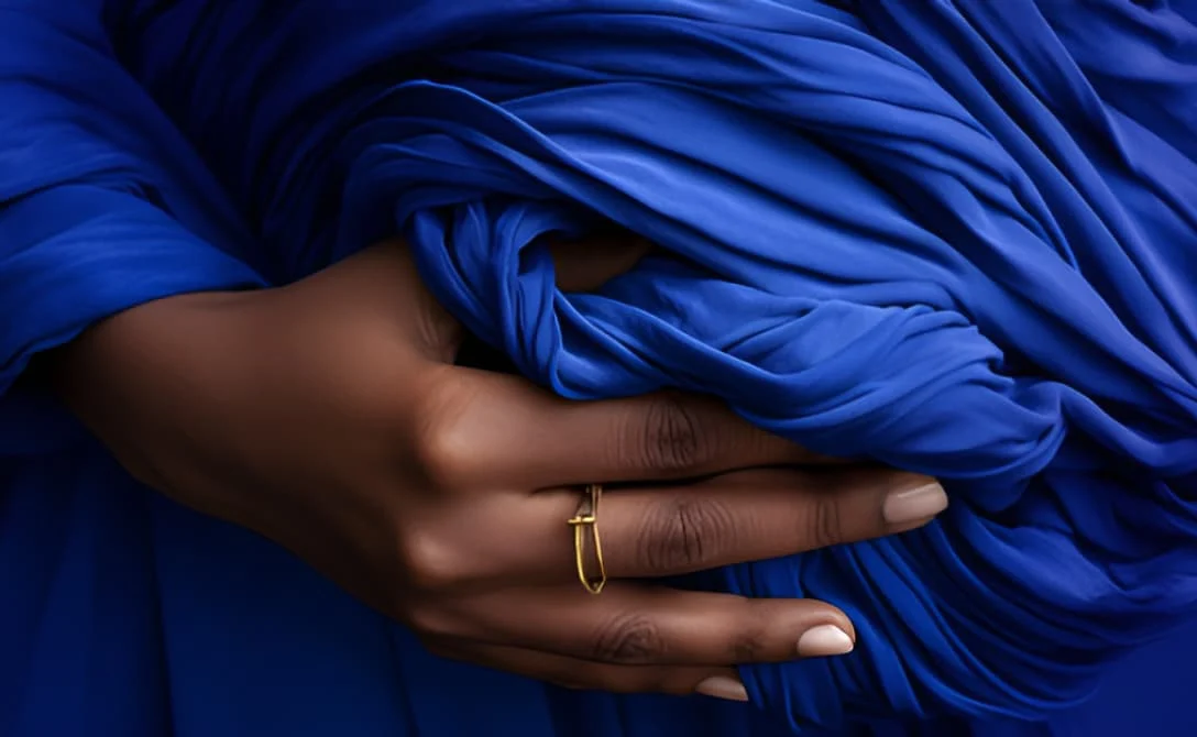
Neutrals and Naturals
Environmental responsibility is central to TrusTrace and our clients. Reflecting this, we incorporate environmental imagery with subtle touches of brand colors, emphasizing our vision of a traceable, circular, and fair future.
Texture Backgrounds
To convey a tactile connection in a digital environment, fabric textures play a key role in our visual identity. These textured backgrounds are effective for layering images or pairing with white text overlays.
Layering
Layered imagery is a hallmark of our brand’s aesthetic, adding depth and visual interest. This technique also reflects the multi-faceted nature of our product and provides a flexible canvas for storytelling. Each layered composition is crafted to support diverse narratives while maintaining a connection to the brand.
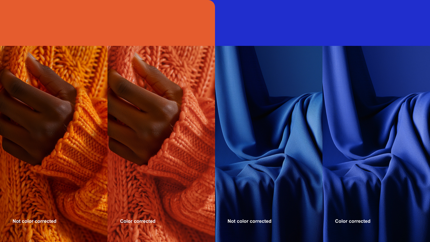
Color Correction
Consistency in our visual storytelling is paramount, and color accuracy is a critical component. Always color correct new images to ensure they align with our brand’s cohesive and polished aesthetic.
Imagery: Do's and Don'ts
Do:
- Prioritize images that align with our message and identity
- Use high-quality, well-lit imagery featuring natural, crisp daylight or studio lighting
- Showcase real people—employees or partners—when faces are included
Don’t:
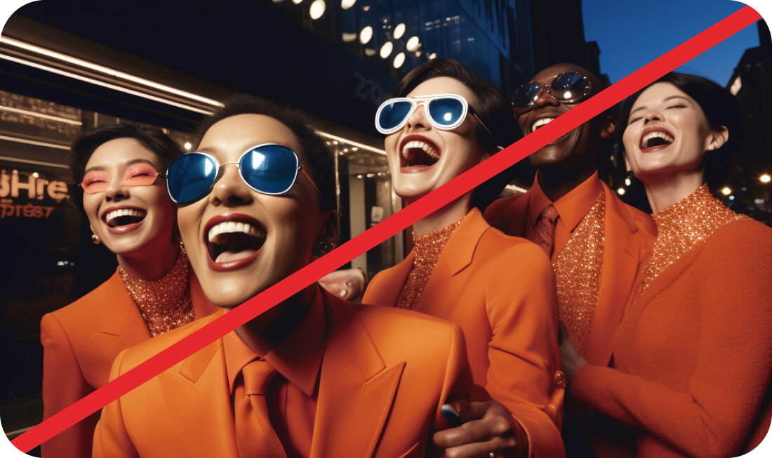
- Use AI-generated faces when showing people; faces must always belong to real individuals, such as employees or partners
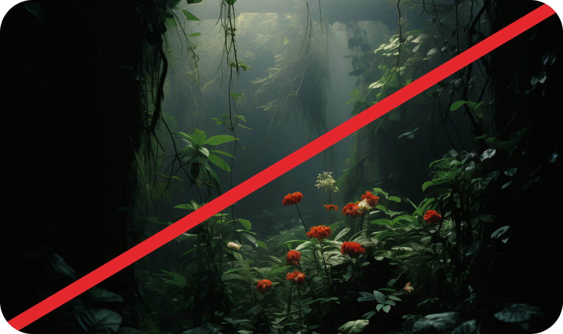
- 3D, vector-style, or heavily stylized graphics
- Tinted filters to images
- Feature imagery that is irrelevant to our message or brand personality
By following these principles, we ensure our imagery consistently reflects the TrusTrace brand's identity and values.


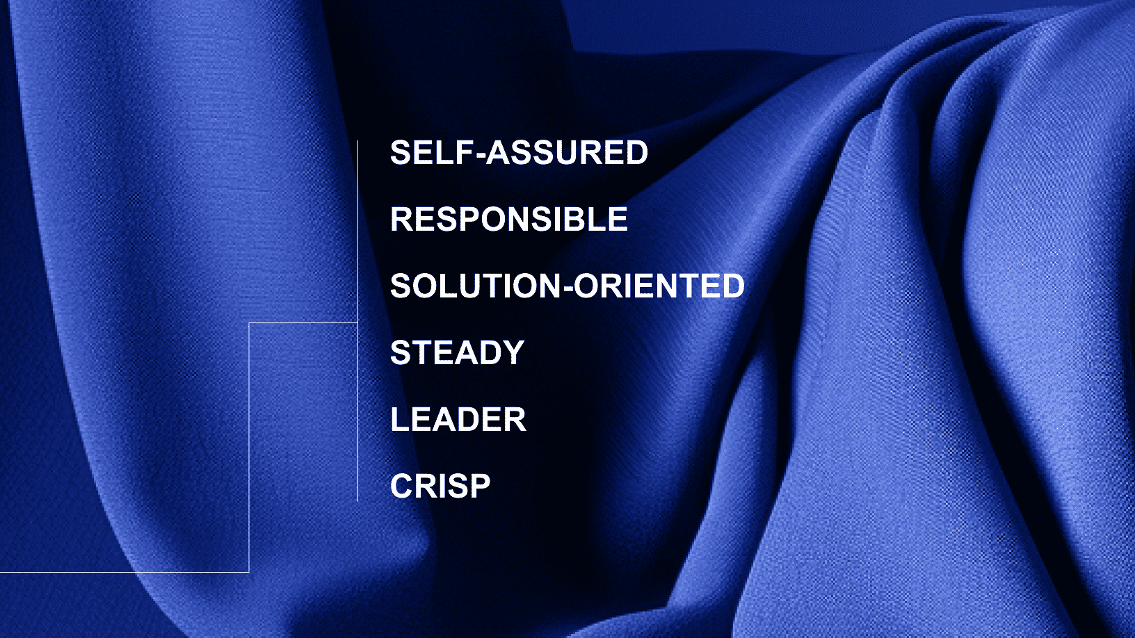
Brand Personality
TrusTrace is the confident leader unafraid of the chaos that comes with trying to gain transparency and traceability within supply chains – in fact, we relish it! We build solutions tailored to brands' and policymakers' needs, turning complexity into clarity. With our technology, customers regain control, achieve sustainability goals, and drive real impact.
ready to trace?